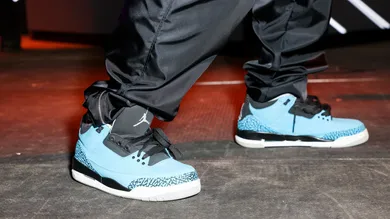
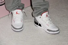
The Air Jordan 3 is one of the most iconic sneakers in history. Designed by Tinker Hatfield and remembered for saving Jordan Brand in the late '80s.
It introduced visible Air, elephant print, and the Jumpman logo. Over the years, it’s been home to some of the greatest colorways ever like “White Cement,” “Black Cement,” “Fire Red,” and others.
But not every pair lives up to that legacy. Some releases have gone off the rails with weird color choices, flat materials, or just straight-up ugly designs.
This list isn’t about hype or resell value. It’s about wearability, execution, and whether the shoe actually looks good. These are the 8 worst Air Jordan 3 colorways of all time.
8. Air Jordan 3 “Cool Grey” (2021 Retro)
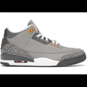
The original “Cool Grey” from 2007 already had mixed opinions, and the 2021 retro didn’t do much to change that. The orange and yellow eyelets feel out of place against the muted grey upper, and the overall look is flat.
The suede doesn’t pop, and the color blocking doesn’t hold up next to other neutral AJ3s. It lacks the punch, contrast, and storytelling that defines the silhouette.
There’s nothing offensive about it, some just think it’s just boring. For a shoe with such a rich design legacy, being this forgettable is almost worse than being bad.
7. Air Jordan 3 “Court Purple”

This colorway had potential but ended up feeling incomplete. The black upper is fine, but the purple and orange accents don't make sense together, leaving the design stuck between Lakers energy and something entirely random.
It doesn’t fully commit to a theme, which makes it hard to connect with. There’s no real story, and the blocking lacks that signature AJ3 balance.
On foot, it looks more like a team shoe than a mainline Jordan. It’s not unwearable, but it’s easily one of the more forgettable attempts from the past few years.
6. Air Jordan 3 “Crimson”
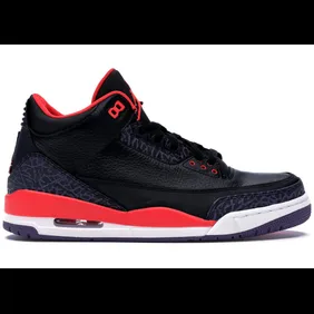
The “Crimson” Air Jordan 3 is one of the loudest entries in the lineup and not in the best possible way. The glossy black upper pairs awkwardly with bright pinkish-red accents and a purple-tinted elephant print that makes the whole shoe feel visually off.
Instead of contrast, there’s chaos. The colors clash hard, and the textures don’t help. While some sneakers benefit from taking risks, this one feels like it was designed without any restraint.
Even at the time of its release, it struggled to gain traction. Over a decade later, it's rarely remembered and when it is, it’s usually not fondly.
5. Air Jordan 3 “Sport Blue”
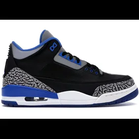
The “Sport Blue” Air Jordan 3 is basically a “Black Cement” with the red swapped out for blue and that simple change threw off the whole vibe. The blue accents don’t feel earned or connected to anything meaningful.
Instead of standing out, the colorway feels like a generic version of something greater. There’s no backstory, no real impact, and no strong identity.
Even the material felt a bit flat. It’s not the worst shoe to wear, but it’s one of the least inspired AJ3s to ever release. A classic silhouette that deserved more than a lazy color flip.
4. Air Jordan 3 “Cyber Monday”
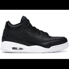
The “Cyber Monday” Air Jordan 3 went all in on minimalism and stripped away everything that makes the AJ3 great. It features an all-black leather upper with a white midsole and no elephant print at all.
No texture, no color contrast, no detail. It’s sleek, sure, but also bland. The AJ3 is known for bold blocking and iconic panels. Without those, the shoe feels generic.
You could mistake this for a budget lifestyle sneaker. It’s clean, but it’s empty. For a model that helped define modern sneaker design, this colorway feels more like an afterthought than a celebration.
3. Air Jordan 3 “International Flight”
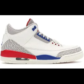
Inspired by a charity game Michael Jordan played in, the “International Flight” AJ3 had good intentions, but missed the mark. The upper mixes sail, fire red, sport royal, and light tan, along with scribble-style detailing on the lining meant to mimic MJ’s signature.
It’s a strange combination that lacks cohesion. The colors feel disconnected, the materials don’t elevate the look, and the overall design doesn’t reflect the energy of the story it’s based on.
It’s not the worst AJ3 ever made, but it’s easily one of the most confused. Too many ideas, not enough execution.
2. Air Jordan 3 “Joker”
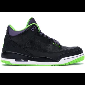
Released in 2013 for All-Star Weekend, the “Joker” Air Jordan 3 felt more like a custom Halloween pair than a proper Jordan release. The black leather base is clean enough, but the neon green accents on the eyelets, lining, and outsole clash hard with the purple inner tongue.
There’s no real story behind the colorway, it’s just loud for the sake of being loud. Even fans of bright sneakers struggled to make this pair work.
It’s one of those releases that tried to be different and ended up just being awkward. The AJ3 is built for balance and this one threw that rule out completely.
It doesn’t help that the nickname made it feel like a theme shoe without a real story. Even a clever concept couldn’t save this strange mix of purple and volt.
1. Air Jordan 3 “Doernbecher”
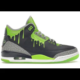
The 2023 Doernbecher Air Jordan 3, designed by 11-year-old Hugo Gonzalez, is one of the boldest takes the silhouette has ever seen. The navy leather upper is covered in electric green “slime” graphics that drip down the collar and tongue, giving the shoe a wild, radioactive look.
Reflective detailing, green accents, and glow-in-the-dark elements on the outsole push it even further into statement territory. It’s loud, flashy, and unapologetically creative, everything the Doernbecher program stands for.
Still, from a styling perspective, it’s a nightmare to pull off. A great story and a meaningful release, but easily one of the loudest AJ3 colorways ever made.
