

The Air Jordan 1 is without a doubt the most iconic sneaker ever made. It is also, at times, the most baffling. For every "Chicago" and every "Bred," there are releases that had sneakerheads scratching their heads and asking why?
This list isn't about shoes that simply underperformed. It is about the ones that really made people question Jordan Brand's creative direction. Here are the 10 ugliest Air Jordan 1 colorways ever made.
10. Air Jordan 1 Retro High OG "White Cement"
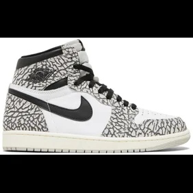
The "White Cement" is the most debatable entry on this list, and also the most wearable. Built on a clean white leather base with grey cement print overlays on the toe and heel, it borrowed its look from the Air Jordan 3 and 4 catalogs.
The problem is that the cement print never really translated to the AJ1 silhouette the way it does on those models. It looked borrowed rather than purposeful, and the overall execution felt like a coloring exercise rather than a considered design.
Some people really love it, and that is also what earns it the bottom spot. It is the least ugly shoe on this list.
9. Air Jordan 1 Retro High Utility "Neutral Olive"
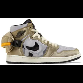
The Utility series took the Air Jordan 1 and gave it a workwear treatment, adding nylon overlays, extra paneling, and a utilitarian aesthetic that divided sneakerhead opinions.
The "Neutral Olive" colorway made the structural changes harder to ignore, pairing a muted olive base with bulky nylon panels that added weight to the silhouette without adding much visual interest.
Further, the chunky lug outsole and the exaggerated collar stitching gave it more in common with a hiking boot than a basketball sneaker. It's the kind of shoe that looked better in renders than in hand. Overall, it was functional in theory but very confusing in practice.
8. Air Jordan 1 High OG "Rebellionaire"
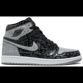
The "Rebellionaire" had a very interesting concept behind it. Jordan Brand built the shoe around the legacy of the original "Banned" commercial, printing "They Can't Stop You From Wearing Them" across the upper in a Shadow-style black and grey colorway and stamping a red X on the heel.
The idea was solid, but the execution was somewhat divisive. The all-over text across the leather panels gave the shoe a cluttered, graffiti-covered look that felt more like something thrown together.
It released in March 2022 for $170 and was kept fairly limited, which helped its reputation more than its design did. It belongs on this list not because the story was bad, but because the shoe struggled to tell it cleanly.
7. Air Jordan 1 High x Gatorade "Cyber"
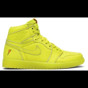
The Gatorade x Air Jordan 1 "Cyber" was built around a neon green "Cyber" colorway that felt more at home on a safety vest than a basketball sneaker. The collaboration itself was solid, as Gatorade and Jordan Brand had real cultural overlap through their shared connection to Michael Jordan's career.
But the "Cyber" colorway pushed the partnership into difficult territory. The neon green hit with full force across the leather upper, with black and white accents that didn't quite balance the intensity of the main color.
Further, the lace details with the Gatorade lightning bolt logo were a nice detail, but it wasn't enough to save the overall look. It also aged quickly in a way that most Jordan 1 colorways don't.
6. Air Jordan 1 High Switch "Purple Pulse"
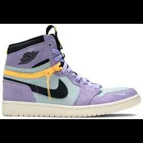
The Switch concept was pretty ambitious. Jordan Brand built a zipper into the ankle collar that allowed the wearer to remove the upper half and turn the shoe from a high into a low on demand.
As a piece of engineering, it was interesting, but as a sneaker, it was a mess. The "Purple Pulse" colorway combined purple suede overlays with blue underlays, a yellow zipper running around the entire collar, and a sail midsole that didn't quite tie everything together.
The result looked like several different shoes competing for the same upper. The zipper hardware also added visual bulk that the AJ1 silhouette was never designed to carry. It released in October 2021 for $175 and is better remembered for the idea than the execution.
5. Air Jordan 1 x Leroy "Leroy Smith"
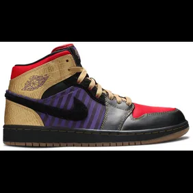
The "Leroy Smith" is built around one of basketball's most famous footnotes. Leroy Smith is the player who allegedly beat Michael Jordan for the last varsity spot at Laney High School in 1978, a story that MJ has credited as one of his earliest motivations.
Jordan Brand paid tribute to Smith with a dedicated Air Jordan 1 colorway, which would have been a great story if the shoe didn't look quite so strange. The color blocking drew from Smith's high school colors, and the terry cloth texture on the upper gave it a material choice that most sneakerheads had never seen on an AJ1 before.
Overall, it was a new look that communicated a personal Jordan story that just didn't really translate over.
4. Wmns Air Jordan 1 Retro High OG "Tie-Dye"
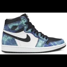
The "Tie-Dye" Air Jordan 1 arrived as part of Jordan Brand's women's exclusive series and immediately became one of the more polarizing releases in that catalog. The shoe wrapped the heel and collar in a vibrant blue and turquoise tie-dye canvas that clashed with the clean leather panels.
The two materials also don't really sit together naturally, creating a visual split that most people couldn't get past. As a styling exercise, it was nearly impossible to work with, and the novelty of the tie-dye treatment faded much faster than we thought.
It's a shoe that looked interesting in press photos and confusing in person. That gap is also what earned it this spot on the list.
3. Air Jordan 1 Retro High OG "Volt Gold"
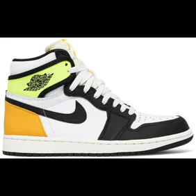
The "Volt Gold" is one of the more confusing color stories in recent Air Jordan 1 history. The white leather base is clean enough on its own, but the combination of colors sitting on top of it is where things fall apart.
A neon volt green ankle collar, university gold toe cap and heel, and black overlays throughout create a color blocking story that pulls in too many directions at once. None of the many accent colors feel like they belong together, and the white base doesn't provide enough neutral ground to tie them all in.
Further, the volt green and university gold pairing in particular has a harsh, almost accidental quality to it. It's a shoe that looks like several different Jordan 1 colorways that got mixed up in the same box.
2. Air Jordan 1 Retro High OG "First Class Flight"
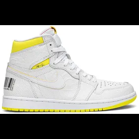
The "First Class Flight" is one of the strangest design decisions in the Air Jordan 1's entire history. Jordan Brand covered the white and yellow leather upper in barcode stamps, recycling symbols, and abstract graphic printing that turned the shoe into something closer to a shipping label than a tribute to MJ's legacy.
The concept was built around sustainability and conscious consumption, which was a worthy message. The execution, however, made the shoe almost unwearable from a styling standpoint. It also sat heavily on clearance racks after release, which is rare for a High OG Air Jordan 1.
The "First Class Flight" is a shoe that had good intentions but ultimately finds its way at number 2 on this list.
1. Air Jordan 1 Retro High OG "Visionaire"
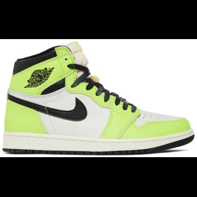
The "Visionaire" is the number one on this list. Jordan Brand wrapped the entire upper in a highlighter yellow-green leather overlay paired with a clean black Swoosh and dark laces that did very little to balance the intensity of the main color.
The sail midsole and the peach tongue padding added further conflicting tones that made the overall colorway not cohesive. The combination of neon green, black, sail, and peach is a lot to process on a single shoe, and most people couldn't get past the aggressiveness of the "Visionaire" green as the dominant panel color.
It generated more negative reaction at release than almost any Air Jordan 1 in recent memory. Overall, it earns the top spot on this list.