In a world of digital music consumption that is feeling the full effect of Kanye West’s 2016 proclamation that “The Yeezus album packaging was an open casket to CDs,” one might be inclined to think that the traditional album cover is on its last legs. Artwork is mostly reduced to a small thumbnail that accompanies an artist’s music, a miniaturization process that is one of the many byproducts of the streaming takeover. Beholden to the strictures of this new era, it would seem that the album cover’s importance would be greatly diminished.
On the contrary, cover art is just as important as ever, if not more so. Cluttered social media timelines that visually bombard users have created an environment in which we judge a book by its cover with repetitive frequency. In an effort to stand out from the crowd, artists must come up with elaborate new visual “hooks” to catch the viewer’s eye in mere seconds as they’re scrolling or clicking. This is a decidedly difficult task for artists that don’t have name recognition or boast a solid fan base, especially when faced with the reality of low attention spans. For consumers straying outside the realm of recommended artists or the familiar faces of social media, the discovery of something new can be an exhaustive undertaking. This is where aesthetic design takes hold: because the visual stimulant precedes the auditory stimulant, if an artist doesn’t make a lasting first impression with their artwork, then the connection is already lost.
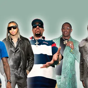
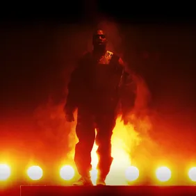
This raises the question of how to generate an immediate emotional connection with prospective fans. Cover art isn’t simply a form of packaging per its original function; it serves a much broader purpose in helping to curate an overall experience. Artists only get one introduction to the world, so they have to find ways to make consumers want to come to them. This complex competitive phenomenon has become especially pronounced in recent years, with artists opting to go a number of different routes. In 2016, Drake latched onto meme culture with the Views cover, which took on a life of its own following the emergence of the viral “Tiny Drake” meme. That same year, Young Thug doubled down on his use of bold imagery to attract attention and start a conversation with the Jeffery cover, which allowed him to push the envelope even further while at the same time staying true to himself. The Barter 6 cover art is another example of Young Thug's artistic cunning mixed with his edgy creative palette: the rapper stands naked in front of an ominously glowing red backdrop, while the words "Barter 6" spew out of him in a rather crude manner. The internet encourages sharing, so if artists can tap into this potential, then they can reach more eyes beyond their usual viewership.
Developing imagery that delivers in this regard is a multilayered affair. Artists have to command their brand and make the right decisions that push that brand forward; visual decisions must be a reflection of this. Beyond establishing a strong and cohesive visual identity, cover art can also act as a starting point for merchandise and other visual mediums. Take, for example, Green Day’s heart-hand-grenade, which became an inescapable image following the release of American Idiot. Or how about Nirvana’s Nevermind, which has ingrained itself in pop culture not only because of its visually compelling capitalist commentary, but also because of the blank-eyed smiley face that has come to be recognized as the logo for grunge music’s biggest act. In distilling their brand down into a single image, an artist must entice their audience to buy into a particular movement and lifestyle.
Besides securing investment from consumers, cover art can also help artists catch the eye of industry figures and A&Rs, who have to sift through a pile of daily submissions in a seemingly infinite expanse of music. Bad artwork can deter interest, whereas clean and striking visuals are more likely to give the impression of a seasoned artist. Amateurish or visibly rushed album artwork may mean that the listener will never arrive at the play button; perceived quality is a barometer of how vested an artist is in their music. Given that the threshold to enter the music industry has been lowered significantly in recent years due to the emergence of widely accessible and user-friendly technology, there’s no excuse for artists not to have quality visuals to accompany their music.
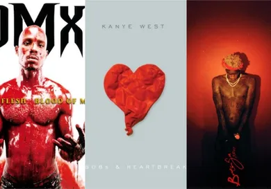
If the idea behind the album cover is to evoke a memorable emotional response, then “generic” is the single most undesirable descriptor. Cover art doesn’t necessarily have to make an artistic statement or be a point of intrigue, but if it’s to a serve a purpose in an artist’s brand, then it must pique people’s curiosity by providing context to the contents within. Look at the three albums that Kanye released leading up to the turn of the decade. Dropout Bear was reimagined for Graduation through the color-popping work of renowned Japanese artist Takashi Murakami. The radiant and vibrant artwork matches Kanye’s full throttle ascent to superstardom in a year that saw him beat out 50 Cent in their high-profile sales war. But the tail end of 2007 brought with it plenty of sorrow, and the cover of 808s & Heartbreak is a poignant embodiment of that period in Kanye’s life. Heavily influenced by Peter Saville of Factory Records, the minimalistic, deflated heart balloon that serves as the centerpiece is a representation of the tragedy surrounding Kanye’s life following the death of his mother. 2010’s My Beautiful Dark Twisted Fantasy, which came on the heels of a tumultuous period involving the Swiftgate scandal, features Kanye naked, straddled by a winged creature. George Condo, who painted the artwork, claimed in an interview with The New Yorker that Kanye made it clear he wanted to generate controversy. The outlandish album cover, which was in fact banned in the U.S., toys with the idea of fame, and Kanye indulges this darker side in the music.
Herein lies the beauty of what is an otherwise impersonal mechanism of distribution: music is spread along with the artwork. The two are intertwined such that the cover art can retain interest and subsequently heighten the listening experience. Just as the title sets the tone before the listener even presses play, the album cover functions similarly. Colors and layout allow the imagery to fall into place in concordance with the music, offering a preview of what’s to come. Like a “still” from a film, this visual representation of a musical work is the ultimate opening statement.
Music is a multi-sensory affair. In hip hop, visuals have always played a significant role, particularly given the genre’s early ties to graffiti culture. But imagine, for a second, if music didn’t have any artwork. The unhinged aggression of Flesh of My Flesh, Blood of My Blood would no longer be accompanied by the grotesque and awe-inspiring image of DMX emerging from a bathtub full of 50 gallons of fake blood. Juvenile’s 400 Degreez would be without its low-budget, Photoshop gloss courtesy of the Pen & Pixel dynasty. As Nasty As They Wanna Be loses its controversial flair, and the iconic photo of 2 Live Crew’s members draped in dookie ropes and peering through the legs of four scantily clad beach goers ceases to exist. Although physical packaging is no longer a serious part of the equation when it comes to an album’s commercial success, presentation of the album cover plays an increasingly critical role in attracting potential viewers and ensuring longevity for the music.